This is the pair coding activity related to Chapter 5.
Task 1: Open the R project for the lab
Task 2: Create a new .Rmd file
… and name it something useful. If you need help, have a look at Section 1.3.
Task 3: Load in the library and read in the data
The data should already be in your project folder. If you want a fresh copy, you can download the data again here: data_pair_coding.
We are using the package tidyverse today, and the data file we need to read in is dog_data_clean_wide.csv. I’ve named my data object dog_data_wide to shorten the name but feel free to use whatever object name sounds intuitive to you.
Task 4: Re-create one of the 3 plots below
Re-create one of the 3 plot below:
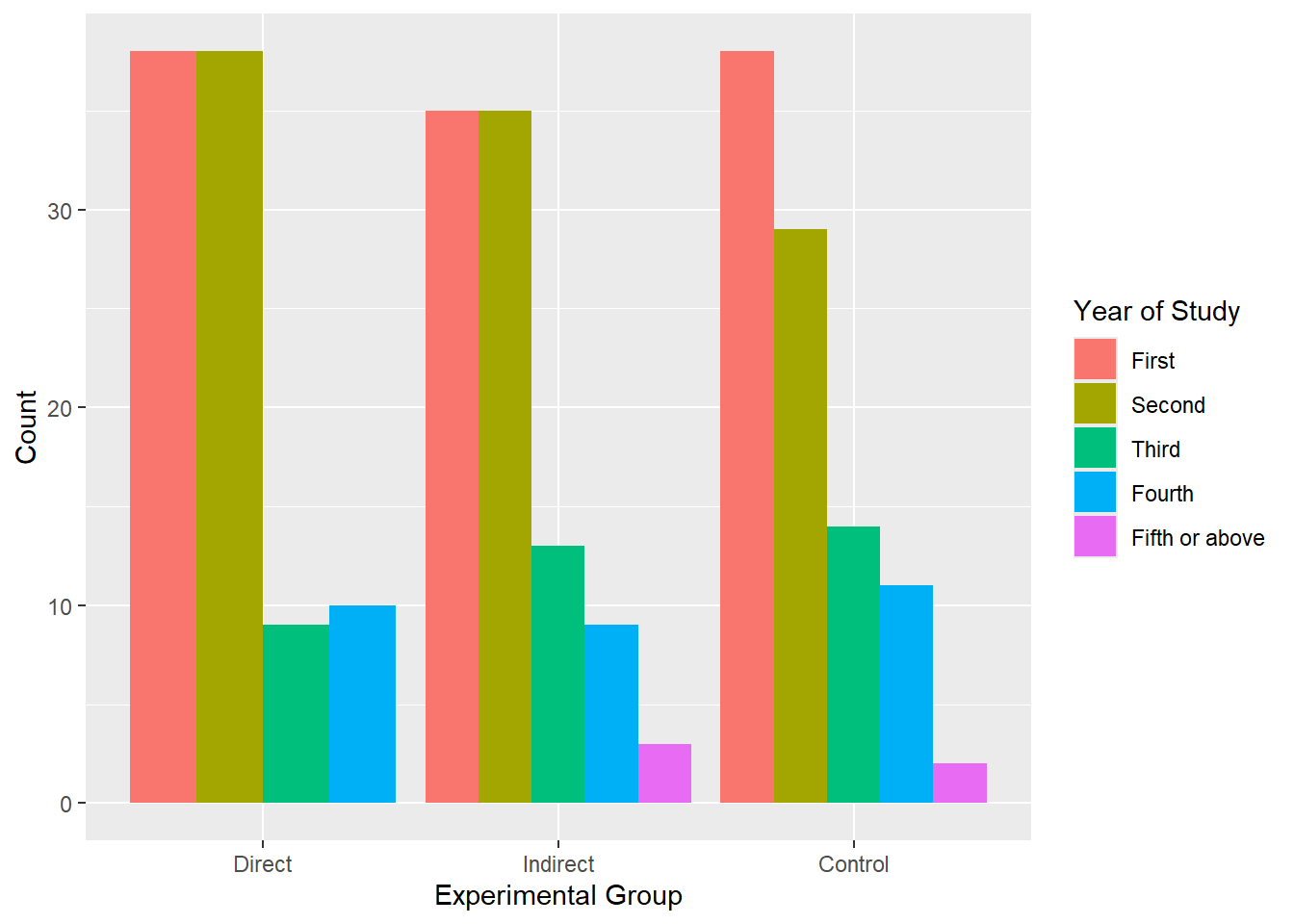
grouped barchart (easy)
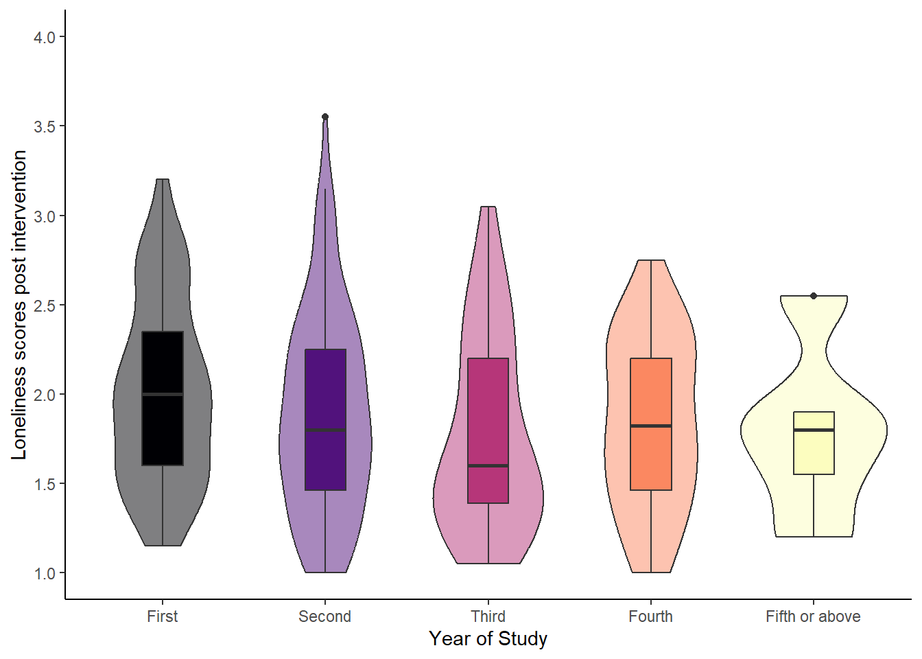
violin-boxplot (medium)
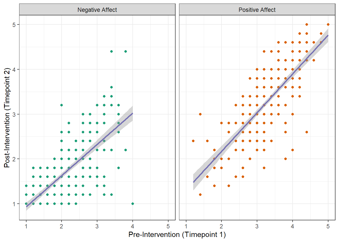
scatterplot (hard)
Difficulty level: easy
Hints
I’ve created a new data object data_bar to select the relevant variables but you could also work straight from dog_data_wide.
Consider turning the 2 categorical variables into factors before plotting
Plotting should be relatively straightforward - these are default colours and you would only need to change the axes labels/ legend title.
More hints
We can change all of the 3 labels in one go. Check out the ## Prettier grouped barchart in Section 4.5, where we did exactly that.
ggplot(data_bar, aes(x = GroupAssignment, fill = Year_of_Study)) +geom_bar(position ="dodge") +labs(x ="Experimental Group", y ="Count", fill ="Year of Study")
Difficulty level: medium
Hints
I’ve created a new data object data_vb to select the relevant variables but you could also work straight from dog_data_wide.
Consider turning the categorical variable into a factor before plotting
Plotting tips:
the colour scale is one of the viridis options
it’s a bit of trial and error for the opacity of the violin and the box width of the boxes (it is totally fine if it looks approximately right)
the tricky part might be adjusting the y-axis ticks. Take inspiration from the histogram in Section 5.3 (Tab Axes labels, margins, and breaks)
ggplot(data_vb, aes(x = Year_of_Study, y = Loneliness_post, fill = Year_of_Study)) +geom_violin(alpha =0.5) +geom_boxplot(width =0.25) +scale_y_continuous(breaks =c(seq(from =1, to =4, by =0.5)),limits =c(1, 4)) +scale_fill_viridis_d(option ="magma",guide ="none") +labs(x ="Year of Study", y ="Loneliness scores post intervention") +theme_classic()
Difficulty level: hard
Hints
Data wrangling: Even though we cleaned the data, it may not be in the shape for the task at hand. Have a look what the data object dog_data_wide looks like and think about how you’d need to restructure it to be able to plot the scatterplot. As always, I would suggest creating a new data object for the scatterplot (e.g., data_scatter).
Once you have the data in the right shape, start plotting. Start with a basic scatterplot and then add various layers and change elements you notice.
Remember, some finetuning might need to be done in data_scatter rather than plot itself.
Data structure you have
RID
PANAS_PA_pre
PANAS_PA_post
PANAS_NA_pre
PANAS_NA_post
1
3.2
3.8
1.0
1.2
2
3.0
3.2
1.8
1.0
3
2.8
3.0
1.6
1.6
4
4.2
3.8
1.8
1.6
5
3.4
4.0
2.2
1.6
Data structure you need
RID
Subscale
pre
post
1
Positive Affect
3.2
3.8
1
Negative Affect
1.0
1.2
2
Positive Affect
3.0
3.2
2
Negative Affect
1.8
1.0
3
Positive Affect
2.8
3.0
Hints for data_scatter
Step 1: select the variables you need from dog_data_wide.
Step 2: pivot all columns (bar the Participant ID) into long format
Step 3: think about how to separate information of the subscales and timepoints
Step 4: pivot from long into wide format. Take some inspiration from the Special case: Variables with subscales scenario above.
Hints for the plot
The colour scheme is Dark2 from the colour palette brewer
The colour of the trendline is #7570b3
Think about how to make the Negative and Positive Affect points different colours. The solution is in Section 5.4
Renaming the different facets is one of those things that should be fixed in the data object instead